
Wednesday, 7 December 2011

Thursday, 24 November 2011
DPS Flat Plan and Rationale

Colour Usage - The main colours used my double page spread are prominently black and grey. This may sound quite unappealing however it matches the rest of my magazine and keeps up with the house style. I have also included an image of a vintage-style globe, which has understated colours which I plan to incorporate into the article. I have used purple as a highlighter colour on my cover and contents page, however I felt it was becoming quite over powering so I decided not to use it on the double page spread.
Image Usage - I am planning to use a lot of related images on my DPS, because the article is about one person, therefore the images should make this obvious. The images will be of me in suitable costume that is relevant to the article and the genre of magazine. These images will either be kept in their original state or will be cut out with the backgrounds removed to make the most of the space that I have left once the text has been put on. One of these images will be the largest on the page, and will be situated directly underneath the title to draw the reader's eye straight to it. The image will be different than the one on the cover and will show the singer in a much more relaxed atmosphere.
Layout and Font - For the layout of my DPS, I decided to start with the positioning of the title. This is in the top left hand corner of the two pages, as this is where the reader's eye is naturally drawn to when flicking through a magazine as it is where the writing starts in a book. From there I then placed the main image of the artist underneath, sat on a globe to tie in with the slogan that she is "taking the world by storm". This ensures that the reader's eye is drawn from the title, down to the image and then onto the article itself. Because it is a main article, I have to include a considerable amount of text, however I don't want the article to become too crammed with text as the reader would probably lose interest. Therefore I have tried to create a balance between the amount of text and the amount of images on the page to keep it both attractive and interesting at the same time to ensure readers are entertained by the article.
Friday, 18 November 2011
Contents Page draft #1

I was really pleased with how it turned out in the end, because I had some problems with images and layout but everything came together well. I feel that it matches my cover, giving my magazine consistency and a clear, recognisable house style.
Contents Page Images
 .

ADELE - This is an image I took when I went to see Adele. To make it into a circle shape I used the stamp tool to get rid of the microphones and cameras. I then used the rubber tool to rub out most of the image and make a faded circle shape around the silhouette
 LEXY LAWS - This is an image of my friend Alex who is featuring in my magazine. To make the image look more professional I decided to cut out the background as it shows a house, so I used the magic wand tool and the rubber tool.

 .

TINIE TEMPAH - This, like the image of Adele, was one I took at a gig. I really liked this image but there were a few items obstructing the image. For example, there were two hands in the way which I needed to get rid of. I used the stamp tool to replicate certain areas of the image and repeat them. I also had to cut out and duplicate one of the bursts of fire because it was originally covered by one of the hands
Monday, 31 October 2011
Contents Page Flat Plan and Rationale

Colour Usage - The main colours used on the contents page of my magazine are black, grey and purple like on the cover. The continued use of these colours gives the magazine consistency and also gives it a clear house style. The shade of purple which I have used isn't too feminine and therefore doesn't put the male population off buying my magazine. The way in which purple is the main colour leaves the option to change this colour each issue by simply replacing every purple item with the same in another colour. This is use of one bright colour is a lot like Q magazine, which I took inspiration from as regards to where to use the purple. I have used it as a highlighter to draw the reader's eye to certain aspects of the page, to ensure the most important things are definitely read.
Image Usage - I am planning to use a variety of images on my contents page to make it attractive and eye catching. Most of these images will be kept in their original state however I plan to cut some out and remove their background to make them interesting and make the most of the space. This will give some variation from the standard straight edged images that I will include a few of at the top of the page. One of these images will be the largest on the page, and will depict the cover model and featured artist 'Ellen'. The image will be different than the one on the cover and will show the singer in a much more relaxed atmosphere. I want her to have very relaxed body language, so it doesn't look like a contrived 'super-smiler' cover image like many pop/fashion orientated magazines include. This will set the tone of the main article and will give the reader an insight into the singer's personality instead of their public appearance in posed photographs or paparazzi snaps. I plan to use props for this relaxed image, to make it seem more fun and young, which will illustrate the singer's age and care-free attitude to life.
Text Usage - All of the text on the contents page will be either the title of the article or a short, snappy sentence describing what the article is about and who features in it. These will all be used as hooks of some sort to draw the reader in and entice them to take note of the page number and in order to read the article. I am including the masthead from the front cover of the magazine on the contents page to introduce what the page is about and form part of the title. The title all together will read 'THE DROP this week', letting the reader know that this page tells them what is in the magazine, without just having 'Contents' at the top of the page. By using small text boxes underneath each image I include, I am using anchorage to attach meaning to the images, instead of them simply being images which the reader knows nothing about.
Layout and Font - I took inspiration from the contents pages of LOOK magazine and NME magazine in order to design a layout for my contents page. I really admired the way in which these magazines find a good balance between text and images and make the most of the room that they have. Neither of the inspirational contents pages were too crowded, which was something I had to be careful of as my front cover (first draft) was very crowded. Therefore I made a clear partition of images and text through the middle of the page, with the exception of a few cut out images. This ensured that the reader's eyes were attracted to the large images at the top of the page, and then their eyes were drawn down to the text with the help of smaller, cut out images alongside the text. I have separated the contents into four categories which are arranged into a square, these are: News, Reviews, Up + Coming and Features. This makes the layout of all of contents much more manageable for the reader to take in and makes it clearer which articles include which content.
Sunday, 30 October 2011
Inspirational Contents Pages...
LOOK magazine
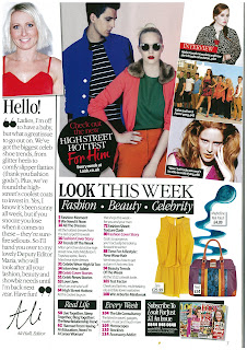 I really like the contents pages that are featured in every issue of LOOK magazine, and this is an example of one.
NME magazine
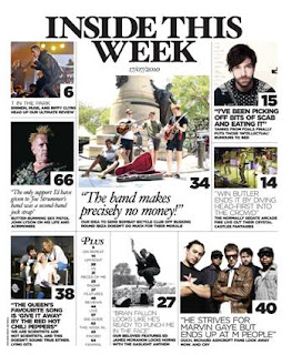 This is the contents page of a newer issue of NME magazine. Compared to the older issues of the magazine, this new contents page layout is much more effective and I find it a lot more appealing.

 I really like the contents pages that are featured in every issue of LOOK magazine, and this is an example of one.
<<<<<<<
Although this is the contents page of a fashion magazine, it is one that I read frequently, and one that I feel has a really effective layout. I like the layout because it's very quirky and interesting without being overpowering. I especially like the way that the images are presented: they have been overlapped, rotated on a slant, and have even been chopped off the side of the page. Each image includes a small text box giving a short indication of what the image is showing/advertising. This is really effective, as it tells the reader what the article is about, and gives them an image to attract them as well as text. I also like the fonts that have been used. Fonts are something which I have to be careful with as the feedback I received for my front cover mentioned that I had used too many different fonts, therefore this contents page is inspirational to me as it shows how I can reduce fonts and still make it attractive. Another aspect of this contents page is the thick black boxes that surround the sub headings to make them stand out. This makes it clear to the reader which articles come under which category, and draw their eye to the more important content.
NME magazine
 This is the contents page of a newer issue of NME magazine. Compared to the older issues of the magazine, this new contents page layout is much more effective and I find it a lot more appealing.
I really like the layout in general; the way that there is a large main image below the main heading of the page, which is accompanied by a quote instead of simply naming the article or the band that it's about. This adds intrigue for the readers, and ensures that they are curious enough to read the quote and study the image, which hopefully leads to a sale of the magazine so they can read the full article. I also like how although there is a lot of content, the page doesn't look crammed or packed too full. This is something I have to be careful of on my magazine, as I feel I put too much on my front cover and made it over powering. Another thing which aids the reader on the contents page is the way that large numbers have been attached to the bottom right hand corner of each large image to tell the reader which page each article is on. This is definitely something that I want to include on the contents page of my music magazine, because as a reader, I find this both helpful and attractive.
Q magazine

The contents page of Q magazine is very plain, and only includes one large image of the main feature band (probably the band which were on the front cover), with the rest of the page being filled by text. However I really like the band across the top of the page with the magazine masthead and the heading of the page, the date and the issue. Another thing which I like about this contents page is the way in which the magazine's main colour has been used. The colour red is one of the things which attracts the readers eye to Q magazine as the masthead is large and bright red, therefore the way it has been carried on as a subtle 'highlighter' colour on the contents page is very effective. It highlights the subheadings and the page number of each featured article, as well as being used to highlight certain words on the page which the magazine wants to draw the reader's eye to. The main colour of my magazine is purple, and would therefore work well in the same way as red has been used, which is something I'm considering using.
Thursday, 27 October 2011
Cover draft #1 / 2

This is the first draft of my magazine's front cover. After finding my cover image and trying it out I decided that an image of one person would work much better than an image of two people. I therefore cropped photo down to just Ellen, and used her name as the main sell line.
The colour scheme of the cover is prominently grey and purple, with purple being used to highlight key parts of the magazine which I want the reader to be drawn to. I put the cover model's head behind the name of the magazine as it covered too much of the masthead for it to still be recognisable.

draft #2
After receiving feedback from my classmates and teacher I decided to change a lot on the cover of my magazine. Although I really liked how the main image looked, I wanted to change the cover model, because I wasn't able to get any other photos of her for my Contents Page or DPS. I also made the mistake of forgetting to include a bar code or the price on the first draft of my cover therefore I had those to add to my second draft. I decided that I didn't like the Ellie Goulding section so I replaced it with my friend Hanni who I had easy access to to take photos.
Subscribe to:
Posts (Atom)