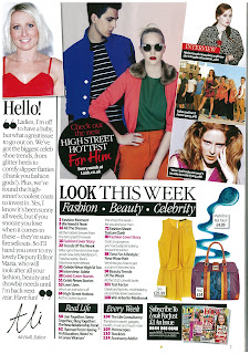
 I really like the contents pages that are featured in every issue of LOOK magazine, and this is an example of one.
 <<<<<<<
Although this is the contents page of a fashion magazine, it is one that I read frequently, and one that I feel has a really effective layout. I like the layout because it's very quirky and interesting without being overpowering. I especially like the way that the images are presented: they have been overlapped, rotated on a slant, and have even been chopped off the side of the page. Each image includes a small text box giving a short indication of what the image is showing/advertising. This is really effective, as it tells the reader what the article is about, and gives them an image to attract them as well as text. I also like the fonts that have been used. Fonts are something which I have to be careful with as the feedback I received for my front cover mentioned that I had used too many different fonts, therefore this contents page is inspirational to me as it shows how I can reduce fonts and still make it attractive. Another aspect of this contents page is the thick black boxes that surround the sub headings to make them stand out. This makes it clear to the reader which articles come under which category, and draw their eye to the more important content.
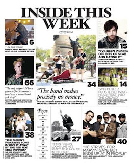
NME magazine
 This is the contents page of a newer issue of NME magazine. Compared to the older issues of the magazine, this new contents page layout is much more effective and I find it a lot more appealing.
I really like the layout in general; the way that there is a large main image below the main heading of the page, which is accompanied by a quote instead of simply naming the article or the band that it's about. This adds intrigue for the readers, and ensures that they are curious enough to read the quote and study the image, which hopefully leads to a sale of the magazine so they can read the full article. I also like how although there is a lot of content, the page doesn't look crammed or packed too full. This is something I have to be careful of on my magazine, as I feel I put too much on my front cover and made it over powering. Another thing which aids the reader on the contents page is the way that large numbers have been attached to the bottom right hand corner of each large image to tell the reader which page each article is on. This is definitely something that I want to include on the contents page of my music magazine, because as a reader, I find this both helpful and attractive.
Q magazine
The contents page of Q magazine is very plain, and only includes one large image of the main feature band (probably the band which were on the front cover), with the rest of the page being filled by text. However I really like the band across the top of the page with the magazine masthead and the heading of the page, the date and the issue. Another thing which I like about this contents page is the way in which the magazine's main colour has been used. The colour red is one of the things which attracts the readers eye to Q magazine as the masthead is large and bright red, therefore the way it has been carried on as a subtle 'highlighter' colour on the contents page is very effective. It highlights the subheadings and the page number of each featured article, as well as being used to highlight certain words on the page which the magazine wants to draw the reader's eye to. The main colour of my magazine is purple, and would therefore work well in the same way as red has been used, which is something I'm considering using.

No comments:
Post a Comment