Friday 16 December 2011

EVALUATION QUESTION 7

Looking back at your preliminary task (school/college magazine), what do you feel you have learnt in the progression from that to your full product?

This is my preliminary college magazine which I called Bede Buzz. Considering I did this at the very beginning of the year without any help from my teacher or any further knowledge of the conventions of magazines, and I'm proud of my efforts.

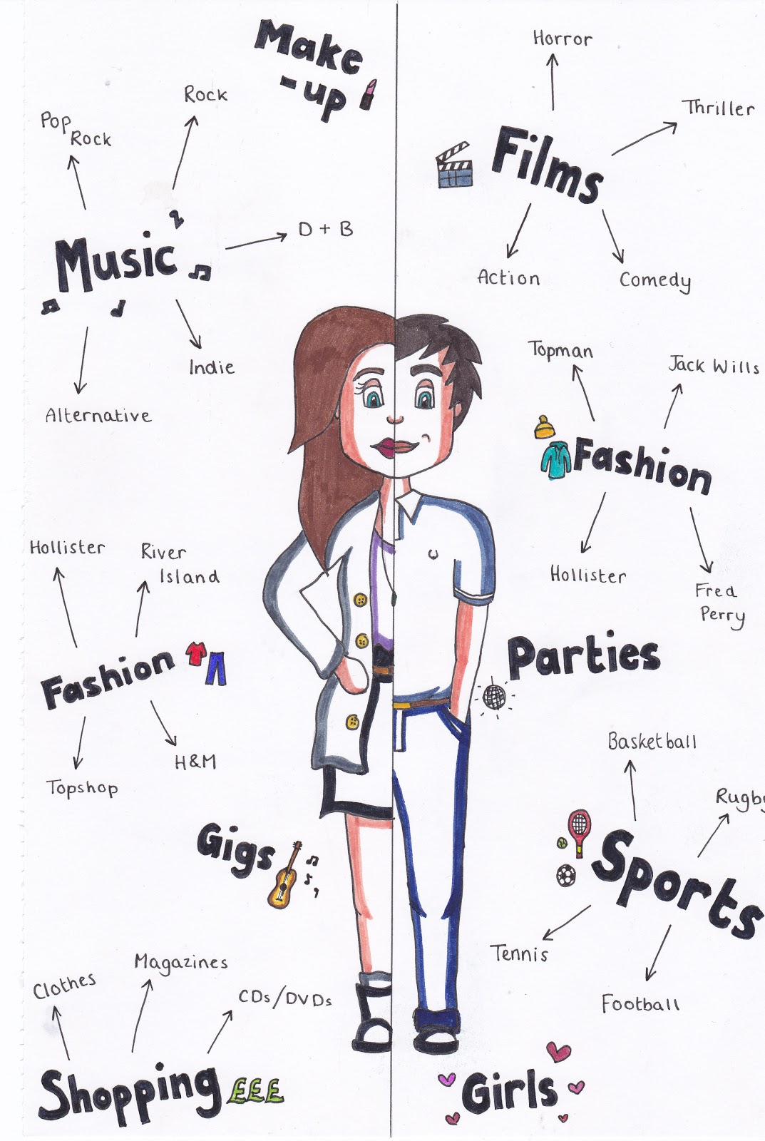
However, compared to my final product, my preliminary task is made to look very amateurish.
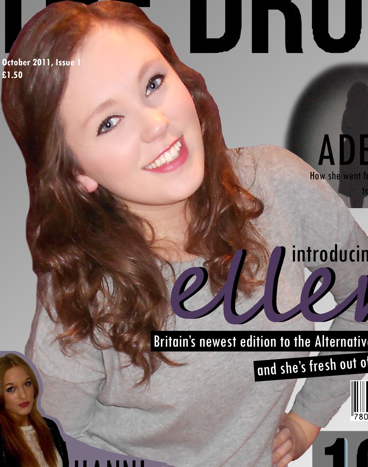
I actually really liked the cover of my preliminary college magazine, and I feel that it has certain similarities to my end product. It has two articles at the bottom of the cover, and two at the top overlapping onto the main cover image. Obviously, I used the same model for both magazines, however they have a similar costume on. The colour scheme is also similar. Although they have these similarities, it is clear that I have taken much more consideration into the layout. By studying different magazines that are already on the market, I was able to gain knowledge of certain music magazine conventions, and ensure that I included them in mine.
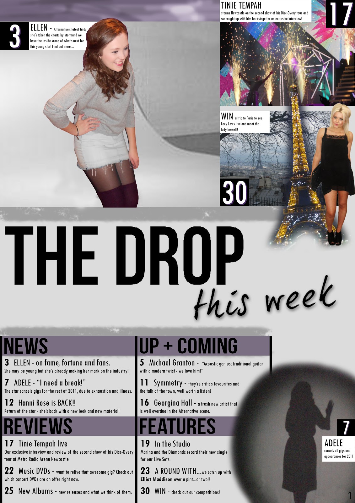
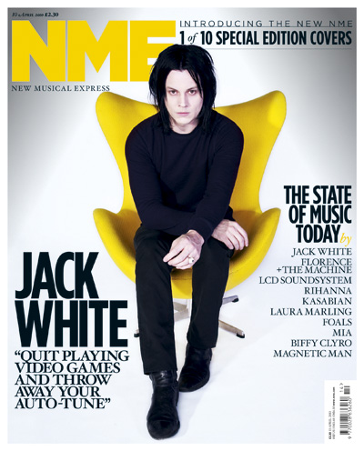
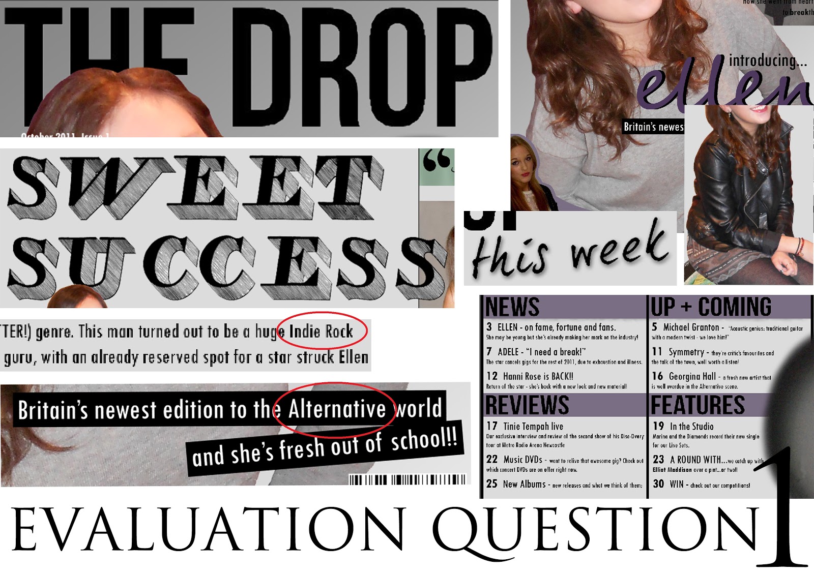
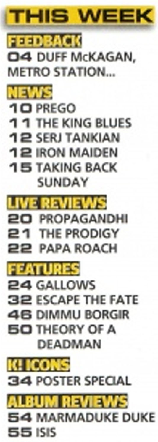
Looking back on the contents page of my college magazine I can see that I had very little knowledge of magazines and how they should look when I create that. It is very simple and very basic, and comparing it to the likes of NME magazine it isn't a magazine contents page at all. It is obviously that I have definitely learnt my way around magazine conventions, and what is needed and expected of a magazine in order to give the reader as much information as possible. The contents page looks professional and actually has images on, unlike my college magazine's contents page which simply has 4 pages of content listed and nothing else.
One of the most striking things that is made known by comparing my preliminary task and my final product is my widened knowledge of new technology. I created the preliminary task in Microsoft Publisher, and hadn't even considered using Photoshop as my knowledge was very limited. However now I have created a successful series of documents using Photoshop which are all consistent and have a very professional feel to them.
 
Overall, I feel that I have made huge progress from my preliminary task to my final product, and I have used my resources and feedback from the first task to my advantage to achieve a good final product. 

Thursday 15 December 2011

EVALUATION QUESTION 6

What have you learnt about technologies from the process of construction this product?

In order to create my music magazine, THE DROP, I had to learn how to use certain technologies, and make use of pieces of kit that I already had. All of these things contributed to my end product of a cover, contents page and DPS for my magazine which had a professional appearance and engaging content. 

CAMERA - photography
One of the most important pieces of kit which aided the creation of my magazine was my camera. It is a Nikon Coolpix S3100, which is a 14.0 megapixel camera with a '5x Wide Optical Zoom'. This was the camera that I used to take all of the photos for my magazine.

Obviously, taking photos of myself wasn't ever going to be as easy as taking them of someone else, however using the settings that my camera had to offer this task was made considerably easier. I used the self timer option on my camera, and by doing this I could delay the photo from taking until 10 seconds after I pressed the button, giving me plenty of time to position myself ready for the photograph.

 
COMPUTER
The other most important piece of kit in the creation of my magazine was the computer. This image shows my personal laptop which I keep at home, but obviously this wasn't the only computer I used to complete my magazine. The work which I completed in college was done on the standard PC that was available to me. Once I had taken any photos I needed to using my camera I then uploaded them to the computer using the SD card slot on the side of my laptop.

PHOTOSHOP
As well as using physical equipment to create my magazine, I also used the software on the computer in order to both edit and create my magazine. The main program that I used was Adobe Photoshop Elements 5.5 which was the edition which was accessible to be at college. At home on my laptop I have a different version of Photoshop however it was still compatible with the work I had done at college. I used Photoshop for two reasons: to edit the photos for my magazine, and also to create the actual documents.

Editing Photos
A lot of the photos that I took had background which I didn't want to be visible in my magazines, and therefore these images required cutting out. To do this I simply transferred these images from my 4GB SD card onto the computer and then saved them in a separate file. I opened them up into Photoshop and then I used techniques that I had learnt in my AS Graphics course which I have been taking along side AS Media. I already had a limited knowledge of Photoshop having played around with it at home and also used it on my work experience at a Graphic Design company whilst I was in Southmoor. I made use of three tools to cut out the images: Magic Wand, Quick Selection and Eraser as shown to the right.


This is the image which is on the cover of my magazine. I have included a 'before' and 'after' example of how I used Photoshop to both crop and edit a photo. I have completely removed the background and cropped the image considerably, as the legs and part of the skirt weren't needed on the cover. I have also used the sharpen tool to make my eyes a lot more prominent and slightly darker to enhance them. Other than that I haven't edited the image much because the look I was going for wasn't that of an over-edited glossy fashion/glamour magazine. This was the case for many of my other images throughout the pages, as I didn't want to falsely advertise perfect looking artists to a body-conscious audience.

Creating the Magazine
As well as editing photos on Photoshop I had to use it to create the actual magazine. This required a lot more skill and I had to make use of more tools in order to make the pages successful. I placed the images that I had edited into an A4 International Paper sized document and used tools such as Text and Shape to add boxes and my main bodies of text to the pages.

BLOGGER
Using this blog has been the means with which I am presenting my planning, progress, finished work and evaluation, therefore it has played a key part in the whole process of making my magazine. By actually talking through each thing that has contributed to my magazine has helped me in the evaluation of my work, and has also helped me see what it was that I was doing wrong, in order to better my work and improve my grade.

EVALUATION QUESTION 5

How did you attract/address your audience?

COVER AND DPS MODEL
One of the ways in which I attracted my target audience was with the cover model. I chose to use myself as this was more convenient for me and ensured I could get the look I wanted without having to involve anyone else. I feel that I don't have an oppressive appearance, and definitely one which would make the readers of my magazine jealous, or make them want to look like me. I wanted to use someone who was relatable, to bend the rules a little and use someone who is normal, and not plastic. I feel that this attracts the kind of audience I was aiming for, as they see a girl who they'd want to read about and hear her story, rather than seeing a robot on the front cover who would make them self conscious about their appearance.
THE USE OF FAMILIAR ARTISTS
As well as including an up+coming newer artist on the cover of THE DROP, I also wanted to incorporate artists who would be recognised by the readers. I included Tinie Tempah and Adele, both of which have been a huge influence in the music industry over the year and have had many hits with the public. These are my own photos which I took at concerts where I saw these artists. The use of famous and current artists will give the reader a sense of familiarity, instead of them seeing a new magazine which only caters for the unknown and unsigned.


COMPETITION
On the contents page of my magazine I have made use of a small area by including a competition. Not only will the audience be entertained by the content and appearance of my magazine, but they will also be given a change to benefit themselves and win a competition. I have linked this competition to a spot in the text at the bottom of the page, to further plant the idea of winning into the reader's mind to ensure they enter the competition:


I then also included a mention of the competition's prize in my DPS. This was possible because the prize that comes with the competition is to see 'Lexy Laws' live and meet her in person, and because this artist was modelled by my friend Alex, it was possible to get an image of myself and her. I included this in the article about 'Ellen' as if they had been spotted partying in London together.

REVIEWS COLUMN
Speaking as a teenager, I know that when I have money, I want to spend it on things that I need, or that are worth while, and therefore I tend not to buy as many music albums as I used to. On the occasion that I want to buy some new music, I would much prefer to read some reviews about the album, and see what other people either my age or older think about it before I spend my money. I usually rely on NME magazine's 'Reviews' section to set me on the right path, and that's why I thought it would be necessary to include a 'Reviews' section in my magazine. When someone picks up my magazine and flicks to the contents page to see what will be included, they will find that there are a number of reviews which will inform them of which albums are rated highly by professional critics and whether or not to spend their money on them.

SPECIFIC GENRE
As previously mentioned, the audience that I was trying to attract was teenagers who are into Indie/Alternative music rather than generic pop music. In order to do this, I had to model my whole magazine on this genre, as this audience wouldn't be attracted to a bright pink magazine with a pretty pop girl posing on the front as they aren't as interested in that genre of music. I took inspiration from  NME magazine primarily; the newer covers which have been redesigned. To introduce these newly designed covers, NME issued a selection of 10 special edition covers which were the inspiration I needed. Their simple layout and sparse coverage caught my attention, and I really liked the way only one main colour was used, unlike Kerrang magazine which I find oppressive.

 
I haven't replicated these covers exactly, but I have only used one main colour on the cover of my magazine, although I have used a selection of different shades of this colour. Like NME, this opens up an opportunity to change the colour of each edition by either matching or contrasting this colour to the costume of the cover model. This simplicity of my cover won't over-face the reader, and will allow them to take it all in without finding the cover too full. This was one of my earlier set backs as one of the main points I received in the feedback from my class mates was that the cover was way too crammed, therefore by taking inspiration from NME, I have overcome that problem and impressed my audience.

EVALUATION QUESTION 4

Who would be the audience for your media product?
The two images above are an overall example of the target audience of my magazine, THE DROP. They are young people in their late teens, aging about 16+ and are both male and female. My magazine isn't specifically tailored to one gender, as I was aiming to create a magazine which would both attract and entertain ''teenagers/young adults'' as a whole, and not just cater for girls or boys. 

My magazine's audience are just starting to change things in their lives. They are starting to go out and are finding themselves, and music plays a huge role in their lives. I wanted to appeal to the population who like the chart music, but who also look deeper into the more underrated artists and genres. I know that my iTunes is a huge jumble of different artists and genres, and that no one can be fully committed to one singer or band.

Due to their age, these teens would still be in full time education either in a secondary school or a college/sixth form, unless they haven't chosen to carry on their education. Because of this, they probably look forward to the weekend a lot, and would typically attend local gigs, events in bars or house parties. Their overall taste would be quite mainstream - with the girls following the latest fashions and the boys wearing whatever it is to keep them up to date, however all of them adding their own personal twist and style. Appearance is such a key thing for the audience of my magazine, and is something they take pride in, rather than trying to become what they see on the cover of a superficial fashion magazine. I wanted to give my magazine a more relaxed aspect, still on trend a current, but not putting pressure onto my audience to look/dress/act a certain way like many magazines advertise.


When my audience actually has money, they would probably spend it on clothes for the girls, make-up. This is me speaking for my friends and I, knowing exactly how teenagers waste their money as quickly as they get it. One of the things which my audience would buy would be a magazine of some sort. This could be a music magazine, or more typically a fashion magazine for the female percentage of my audience. That is why I wanted to create a music magazine with a fashion twist: a magazine that my audience could rely on to be filled with the things they are most interested in. The price of my magazine was also another aspect which I knew would appeal to my audience. This is because it is priced at £1.99, a very reasonable price, and one which I think teenagers wouldn't begrudge paying for a decent magazine.

Some examples of music that my audience may listen to are listed below along with their relevant music video:

Two Door Cinema Club - Something Good Can Work
http://www.youtube.com/watch?v=1PorW3y5n1w

Marina And The Diamonds - Radioactive
http://www.youtube.com/watch?v=dU7GoCKSQfg


You Me At Six - Bite My Tongue
http://www.youtube.com/watch?v=l1CTbE3u0PQ&ob=av3e
Deaf Havana - I'm A Bore, Mostly
http://www.youtube.com/watch?v=6h-SAdTo8T0&feature=related

I think that my audience are very likely to buy my magazine, as music is a huge part of their lives, and from personal experience, many teenagers can play an instrument and attempt to create their own music. I therefore feel that the content of my magazine is ''right up their street'', and that they would definitely create room in their budget for THE DROP.

EVALUATION QUESTION 3

What kind of media institute might distribute your media product and why?

IPC MEDIA
As NME magazine has been the most inspirational magazine in the process of creating my own, I looked into it's publisher. I found that it is IPC Media, a company who produce over 60 media brands inlcuding other magazines such as Marie Clare, Look, Now and many more.


BAUER MEDIA
Another publisher that I looked into was Bauer Media, which I found publishes a huge amount of popular magazines of all different genres. These inlcude women's magazines such as Closer, heat, GRAZIA and more!. Then there are the men's magazines, both entertainment and lifestyle: Empire, Kerrang!, Q and FHM.


When I think of what I consider to be the most popular magazines, they all seem to fall under these two publishers, and therefore I believe that either of these would be willing to distribute my magazine. These companies obviously know how to successfully promote and sell products, and have supported many of the most read magazines in the country today, making them a clear asset to have when looking to distribute a magazine.

Although they already house a lot of magazines already, the amount that they publish shows that numbers aren't necessarily a factor, and neither are similarities in the magazines. My magazine may have a few similarities to the likes of NME and Kerrang!, however I have tried to make it as unique as possible. I didn't want to create a magazine that was only about music, I wanted to fuse a few genres together to create a hybrid of fashion, film and celebrity gossip that all revolve around the main music concept. For example, the main article may be about a new three piece band who have stormed the charts, who tell my magazine's interviewer about their troubled past, paired with a sub article showcasing their signature clothing style. I feel that this is exactly what the magazine industry needs; something new and fresh to attract the audience which are over looked and not considered important.

Taking this into consideration, if either of these companies were to see my magazine and notice how unique it is, they would hopefully publish it alongside their existing magazines. I don't see it as competition for any of the current music magazines as it is attracting an audience who haven't really been catered for, and therefore won't have any effect on current sales, eliminating one of the reasons a publisher may turn my magazine down.

DISTRIBUTION
Once magazines have gained a publisher, there are many ways in which the actual product can be distributed. The main one of these for a magazine being in stores such as local newsagents and supermarkets. Depending on the type of magazine, they can be given away free in their relevant stores such as ASDA magazine which is simply given away in order to advertise certain deals available in the store. However as my magazine is a music magazine and isn't made along side a radio station like Kerrang!, it needs to be sold in mainstream supermarkets and newsagents.

Another form of distribution which has only come about in the past few years is magazines in the form of Apps. For example, NME have an iPod/iPhone app that can be bought through Apple. Having an app would broaden the audience of my magazine, and would also gain readers. The NME app is only 69p to buy, and requires no further payments. This is a very small price compared to many other apps, and therefore I think that it is frequently bought and used, with iPhones being one of the most popular phones to have around the world. If I was to have an app I believe that once purchased, it would give the buyer a taste of the magazine, and would hopefully persuade them to go out and buy the real thing.

EVALUATION QUESTION 2

How does your media product represent particular social groups?
NME is the magazine which I took most of my inspiration from, as it had the look I was going for, is a music magazine and is also of the same genre which I was aiming to achieve. Above I have chose three covers of NME magazine featuring female solo artists quite like Ellen who is featured in my magazine. The cover featuring the artist Rihanna is similar to my cover image as regards to the model's pose; and on the hip and edging forward slightly. Although this pose may be similar, the image on the NME cover is slightly harsher than mine, and the body looks contorted rather than in that pose naturally. My cover is portraying a happy, smiling girl who is leaning forward naturally as if she was laughing. I feel that this represents a young female social group, one who may not be huge fans of the pop music industry, but who still want someone who they can look up to within their genre. I feel that the cover is quiet arrogant and stand-off-ish, whereas my cover image is welcoming and gives groups of young girls someone to notice, and want to read about, and not just because they are a celebrity like Rihanna. The facial expressions are quite solemn on all of the NME cover, and very reserved, compared to the model on the cover of my magazine, who could be referred to as a stereotypical ''super smiler''.

The costumes which the artists wear on the cover of NME are always very unusual, and are tailored to the artist's taste and reputation. They are wacky and totally unlike what any normal person would wear, which can attract readers but also put them off. My cover model is dressed in a plain grey jumper, and has no crazy props or anything else to distract the reader. This may not be the most attractive image however it portrays a normal girl, who just happens to have a talent and has finally made it into the music industry. This girl isn't trying to be something outlandish, and isn't parading around with a vulture on her shoulder, and is therefore winning the readers simply by her normality. I wanted to attract an audience of young people who shouldn't be bothered about living up to the expectations of mainstream media, and should wear what they like and not have to play up to get noticed.

EVALUATION QUESTION 1

In what ways does your media product use, develop or challenge forms and conventions of real media products?

TITLE OF THE MAGAZINE
Well, the title of my magazine is shown in the top left hand corner of the image about, and is called 'THE DROP'. To a certain percentage of readers the meaning behind this title would be unknown, however to my target audience it is well known. This is because it is the explaination of a certain point in many songs where the music reaches a crescendo or fades out into silence, then the music starts up again suddenly, hence the phrase 'the drop'. This title is short and snappy, making it easy for the reader to process and understand. It is situated at the top of the front cover and is the width of the page. This is very typical of most magazines such as Kerrang and LOOK, and acts as a hook to draw in the reader. This works by attracting their eye to the boldest part of the magazine: the title, then this leads their eye down the whole cover, enabling them to take in all of the information without losing interest.

COSTUMES/PEOPLE
The cover model of my magazine is actually myself, as it was much easier to take photos of myself for the cover, contents and DPS. I could achieve exactly what I wanted without having to direct another model, therefore achieving the best outcome possible. Typically, on the front cover of any magazine, the model featured in the main image would be dressed in something flashy, indication wealth and fame, however on the cover of my magazine the model is wearing a simple grey jumper. This is because I wanted her to appear relaxed and normal, to tie in with the article in the DPS. Because of this the main image on my cover isn't very conventional, compared to the outfits which appear on the cover of most fashion and music magazines, however I can justify this choice because of both my target audience and the message I want to send to the readers.

TITLE FONT AND STYLE
The font that I have used for my masthead is called Bebas Neue and is from http://www.dafont.com/. I wanted to ensure that the font was plain and readable, with no fancy flicks or swirls. Plain fonts are key to the masthead of a magazine, as they ensure that the reader can recognise the name of the magazine straight away, without having to concentrate on deciphering a complicated font. Another font which I have used is called Lead, and was also fount on DaFont. It is the font which I have used for the title of my DPS saying 'SWEET SUCCESS'. This font isn't typically girly or pretty, and fits in well with my genre and mood of the magazine. It has quite a bit of detail on and therefore doesn't follow the conventions of a typical article title, however it is relevant to the article and the magazine's genre.

WRITTEN CONTENT
Another typical convention of most magazines is to have the words 'this week' feature somewhere on the contents page. This occurs in both fashion and music magazines, such as LOOK and NME.


I chose to incorporate this into my contents page because it made it look more realistic as a magazine, and because it makes the intentions of the page clear: to tell you what is in this week's issue of THE DROP.

MUSIC GENRE
There are a few indications of the genre of my magazine throughout the cover, contents and DPS. An example of this is on the cover, in the short explanatory sentence underneath the main sell line. It reads "Britain's newest edition to the Alternative world...", therefore indicating at a genre. Because the genre of the featured artists is Alternative, this suggests that the whole magazine will be based around this genre. This knowledge helps the reader decide whether or not they will be interested by the content, and whether or not to buy it. Another suggestion of genre is in the DPS article, which mentions an Indie Rock guru. Because this other genre is similar to the first, the reader can now begin to appreciate that the magazine has a specific genre, which could lead to the magazine's reputation.

LAYOUT
One of the sections on the above image shows the bottom section of my contents page. It is the part of the page which informs the reader of the most important parts of the magazine, what they feature and where to find them. Like many magazine contents pages, mine has been split up into four sections, each with a heading; News, Reviews, Up + Coming and Features. This is very similar to the printscreen to the right, which I have taken from an issue of Kerrang. All issues follow this layout for the contents information, therefore making my use of this method conventional to not only magazines in general, but also to music magazines of the same or a similar genre.